How to Fix Your Signup Form and Email Funnel Conversion Rates
1 Jun 2025 · 4 min read
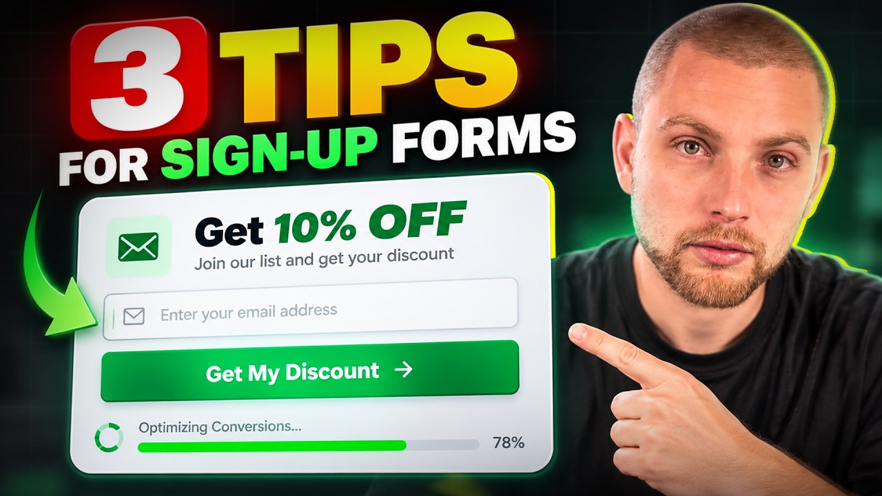
Stop Hiding the Discount Behind Mystery Offers
Capturing zero-party data on your popup is smart, but hiding the actual incentive behind a vague mystery offer often backfires. If you ask visitors what product category they care about, you need to reward them with an explicit reason to finish the sign-up process. Vague copy creates hesitation right at the point of capture.
You should test explicit discounts such as 10% or 20% off against mystery framing. In my books, the metric that matters is not just your raw subscription rate, but your subscription-to-conversion rate. Getting 1,000 email addresses means nothing if only 1% of them turn into paying customers on day one.
The Problem with Forcing Phone Numbers in Step Two
Multi-step forms are standard practice now, but how you handle the SMS step makes or breaks completion rates. Asking for a phone number on step two, even with a skip button, introduces immediate friction. A significant portion of users will simply close the modal rather than look for the tiny opt-out text.
When users drop off on step two, they never reach the success screen and they never see the discount code. You are sacrificing immediate on-site conversion rates in exchange for collecting low-intent SMS numbers. That is a mistake. SMS consent gathered through aggressive gates usually reflects curiosity rather than strong purchase intent.
Show the Voucher on the Success Step (Do Not Make Them Leave)
The single worst thing you can do on a signup form is withhold the discount code on the success state. When you tell a visitor to check their inbox to get their voucher, you are actively encouraging them to leave your store. Once they switch tabs to open their email client, you lose control of their attention.
Your success step should display the code clearly and provide a one-click copy button, or auto-apply the discount straight to the checkout session. Keep the shopper on the site while purchase intent is at its peak. The email should simply be a backup receipt for later.
Fix the Hand-Off Between Welcome and Abandoned Cart Flows
If your welcome flow fails to deliver instantly, your other automated flows end up doing the heavy lifting by accident. A new subscriber who does not get their welcome email will often browse, add an item to their cart, and leave. Hours later, they receive an abandoned cart message offering the 10% discount they should have received ten minutes after signing up.
This creates a messy subscriber experience and delays the first order unnecessarily. Ensure your welcome flow triggers within seconds of submission, bypassing any unnecessary delay blocks on the initial email. Your welcome flow and abandoned cart flow need clear trigger filters so they do not clash when a new visitor abandons quickly.
Above-the-Fold Rules for Cart Recovery Emails
When you look at your cart recovery emails, the core offer and the primary call to action must sit above the fold. If a subscriber has to scroll down past lifestyle banners just to see what they left behind, click-through rates plummet. Put the incentive and the direct checkout link right in front of them.
There are three non-negotiables for high-converting cart recovery emails:
Lead with the offer in the subject line: State the 10% off directly so the benefit is clear before opening.
Match the imagery to the cart: Show the exact dynamic product left behind rather than a generic collection image.
Provide an immediate click target: Place a distinct button above the fold that routes directly to their pre-filled checkout.
Use Teasers and Floating Reminders While Browsing
Most ecommerce stores treat popups as a one-and-done interaction. Once the visitor closes the modal, the offer vanishes from their screen until they reach checkout. That leaves a massive blind spot while they are actively evaluating products on your collection pages.
Implement a subtle slide-in or teaser tab in the bottom corner of the screen that remains visible while the user browses. This persistent reminder keeps the discount code top of mind without obstructing their mobile or desktop experience. It bridges the gap between opt-in and final purchase.
Final Thoughts
Optimising your email revenue starts long before a campaign goes out. By cleaning up your popup friction, delivering discounts instantly on-site, and aligning your flow triggers, you turn casual traffic into immediate buyers. Small adjustments to your capture mechanics create compounding gains across your entire funnel.
Audit and Fix Your Sign-Up Strategy
If you want to turn more site traffic into first-time buyers with higher-converting forms and flow architecture, explore our Sign-Up Forms service to see how we build high-performing acquisition funnels for growing brands.
Let's talk
Ready to grow your email revenue?
Book a free audit and we'll show you exactly where the revenue is hiding.