Everything else in email marketing depends on the list. The best welcome series in the world does nothing if nobody is joining it, and the difference between a sign-up form that converts at 2% and one that converts at 6% is the difference between a list that doubles this year and one that stays flat. The form is also the cheapest thing on your site to improve: it takes minutes to change and you see the result within days.
This guide covers how I build and test sign-up forms for ecommerce brands, mostly in Klaviyo: the offer, the form itself, where it goes, what to ask for, and what to test once it is live. Each section links to the detailed walkthrough.
Start with the offer
The offer matters more than the design. A beautiful form with a weak offer loses to a plain one with a strong offer every time. For most ecommerce brands the strongest offer is a discount on the first order, and the way it is framed changes the conversion rate: a percentage usually beats a dollar amount, even when the dollar amount is worth more, because it reads as bigger. See Why Percentage Discounts Beat Dollar Offers for Ecommerce and How to Choose the Best Offer for Your Klaviyo Pop-Up Form.
There is a trade-off. A bigger discount grows the list faster but trains customers to wait for codes and eats margin. The mistake that costs the most is in The Number One Klaviyo Pop-Up Mistake Hurting Margins. Two ways round it: tier the discount so the biggest offer goes only to people who give you more (The Two-Tier Klaviyo Sign-Up Form Strategy That Scales Lists), or show the code only after sign-up rather than on the form. Whether to show it is its own question, and Should You Show Discount Codes on Your Sign-up Form? gives both sides.
Building the form in Klaviyo
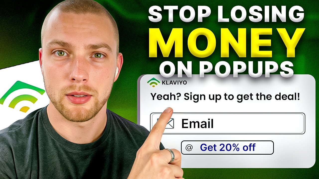
The form itself should be simple: one headline that states the offer, one email field, one button. Every extra field costs sign-ups. The build is in How to Build High-Converting Klaviyo Sign-up Forms, and the settings that matter most once it is built (timing, frequency, which pages, which devices) in How to Optimise Klaviyo Pop-Up Forms for Conversions. For small changes that make a big difference, see 3 Sign-Up Form Tweaks That Boost Conversion Fast.
If you are on Omnisend, the same principles apply: How to Grow Your Ecommerce Email List in Omnisend.
Teasers
A teaser is the small tab that stays on screen after someone closes the pop-up. It catches people who were not ready on the first visit but want the offer later. Whether it is worth having depends on your site: Should You Use Klaviyo Pop-Up Teasers?.
Single or double opt-in
Double opt-in cuts your sign-ups but protects your list from fake addresses and bots. Single opt-in grows the list faster but needs other protection. Which one to use, and when to switch, is in Single Opt-In vs Double Opt-In for Ecommerce Brands. If bots are already hitting your form, read How to Identify and Fix List Bombing in Klaviyo.
Where the form goes
Most brands have one pop-up on the homepage and nothing else. The brands with the biggest lists have forms in several places, each matched to where the visitor is.
- Homepage and collection pages: the main pop-up with the first-order offer.
- Product pages: a lower-key form, because the visitor is already looking at something specific: How to Increase Product Page Email Sign-ups in Klaviyo.
- Exit intent: a form that triggers when someone is about to leave, often with the offer they ignored the first time: How to Use Klaviyo Pop-Up Forms to Recover Lost Sales.
- Embedded forms: in the footer and on content pages, for people who do not like pop-ups.
Pop-ups are not only for collecting emails. Used well they lift on-site conversion for people who are already subscribed, by reminding them of an offer or a product they looked at: How to Use Klaviyo Popups to Increase Onsite Conversions. To see all of this working together on a large store, read What an Eight-Figure Store's Sign-Up Form Setup Looks Like.
Email, SMS or both
Asking for a phone number on the same form as the email address is the most common way brands hurt their sign-up rate without noticing. People give an email readily and a phone number reluctantly, and if you ask for both at once you lose some of the emails. The better pattern is a two-step form: email first, then an optional second step for the phone number with its own reason to give it. Why this matters is in Why Asking for SMS on Your Signup Form Kills Sales, and how to capture SMS properly in SMS Marketing in Klaviyo: How to Capture and Convert Leads. The same two-step logic works for WhatsApp: How to Properly Capture WhatsApp Consent in Klaviyo.
Growing the list without discounts
Discounts are not the only way. Content, tools and community can all bring people onto a list, and the subscribers they bring tend to be more engaged than discount hunters. Three approaches in Three Practical Ways to Grow Your Email List for Free and How to Grow Your Email Newsletter List for Free. The wider argument for why the list is worth the effort at all, compared with building an audience on someone else's platform, is in Email Marketing vs Social Media: Why You Must Own Your Audience.
What to test
Once the form is live, test one thing at a time and leave each test long enough to mean something. The order I test in is offer, then headline, then timing, then design, because that is roughly the order of how much each one moves the number. What is worth testing and what is not is in What You Should Actually Test in Your Sign-Up Forms.
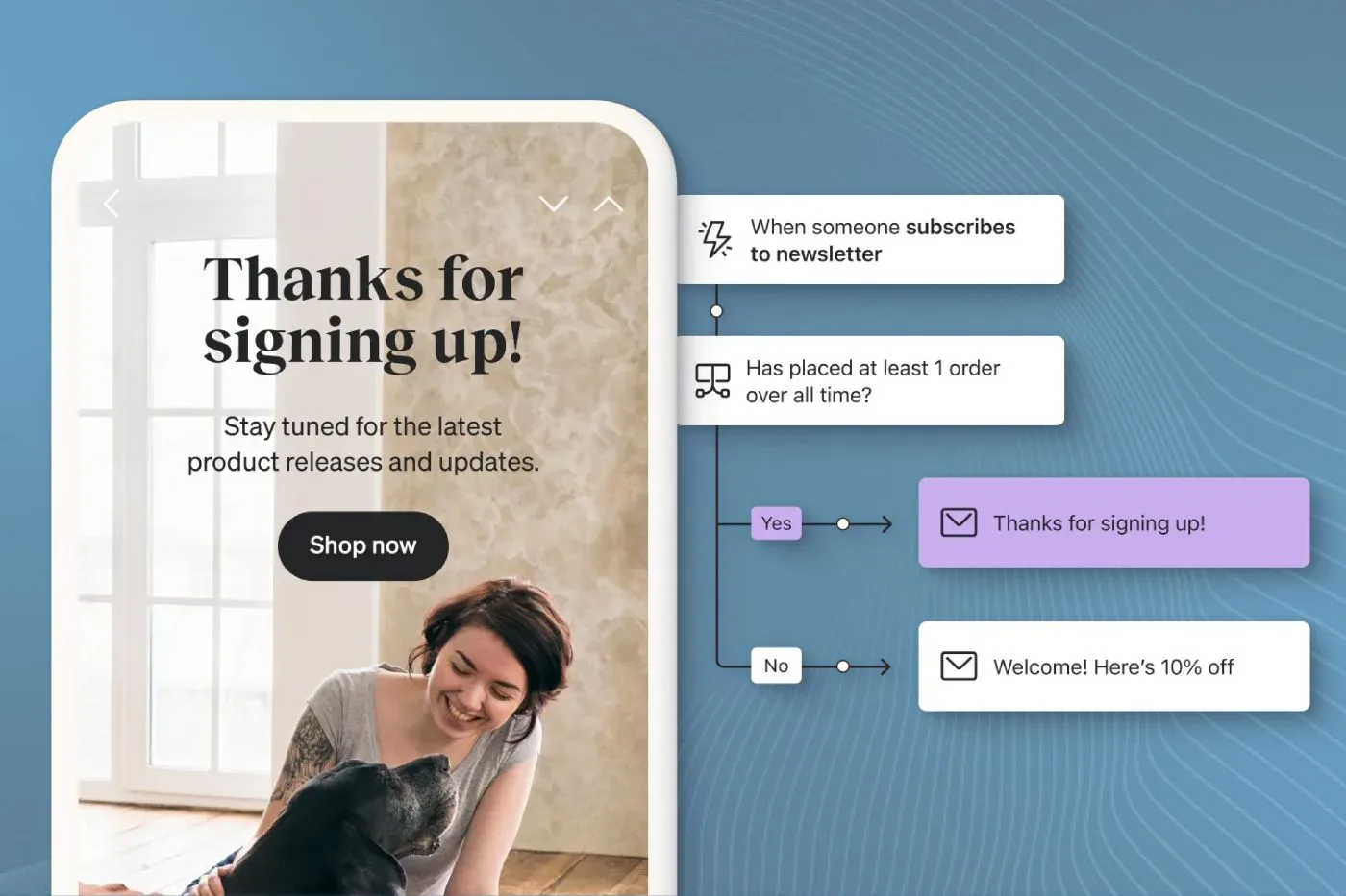
The form is only the first step of a funnel. If sign-ups are fine but revenue from new subscribers is not, the problem is usually the welcome series that follows, not the form. How to look at the two together is in How to Fix Your Signup Form and Email Funnel Conversion Rates, and the welcome series itself is covered in How to Build a High-Converting Klaviyo Welcome Series. To measure the whole path from sign-up to first order, see How to Calculate Your Subscription to Conversion Rate and How to Analyse the Klaviyo Subscriber Growth Report.
Preference pages
The last piece is what happens when someone wants fewer emails. A preference page that lets them choose topics or frequency keeps a subscriber you would otherwise lose to the unsubscribe link. Setting one up is in How to Set Up and Customise Klaviyo Preference Pages.
The short version
- Lead with the offer, framed as a percentage, and protect your margin with tiers or a post-sign-up reveal.
- One field, one button. Ask for the phone number on a second step, never alongside the email.
- Forms on the homepage, product pages and exit, not just one pop-up.
- Test the offer before you test the colours.
- Judge the form by revenue from new subscribers, not sign-ups alone.
If you want this built and tested for you, our sign-up forms service does exactly that, and the welcome series that follows is part of our email automations work.