Accessing the Executive Business Review Tool
Klaviyo replaced the old Growth Review with the Executive Business Summary report. It is one of the cleanest automated reporting tools Klaviyo offers, but there is one catch. You need a Klaviyo Partner account to access the generator.
If you do not have a partner account yet, head to the Klaviyo Partner portal and create one. It is free and takes roughly 2 minutes to set up. Once you are registered, you can run these reports for any account linked to your partner portal. In our agency portal, we manage around 150 client accounts, and we can generate a bespoke report for every single one of them from the same dashboard.
Setting Your Parameters and Metrics
Once you are in the tool, you need to select your timeframe and conversion data carefully. You can generate reports on a monthly or quarterly basis, comparing the selected period against the prior period or the previous year.
Never run a quarterly report midway through an active quarter. If you run a Q4 report on 11 October, it will compare roughly 11 days of performance against a full 90-day Q3. That is a waste of time. Always run it for the month or quarter that has fully closed.
Next, select your core conversion metric and currency. If you run Shopify, this will usually be 'Placed Order'. If you run custom checkouts or software platforms, you might map it to 'Successfully Paid' via Stripe. Make sure your currency matches your primary store reporting so the revenue numbers align with your internal books.
What the Report Generates
After you hit generate, Klaviyo processes the files and emails you a direct download link. When you open the package, you get three files: an appendix, a raw data spreadsheet, and a pre-formatted PowerPoint presentation.
The PowerPoint deck is what matters. It is professionally formatted, visually clean, and breaks your data down into five core areas:
- Executive summary: Total profile growth, recipient counts, and overall revenue attribution.
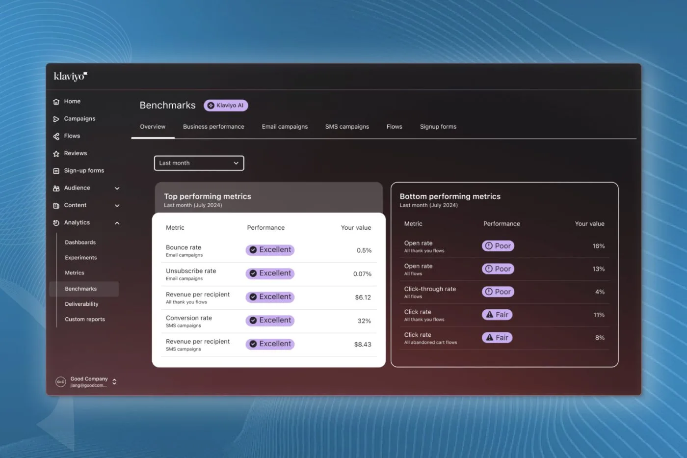
- Industry benchmarks: Your performance stacked against peer ecommerce brands in your vertical.
- Channel deep dive: Detailed breakdowns of campaigns versus automated flows.
- Flow and segment performance: Engagement rates, revenue per recipient, and list movement across major cohorts.
- Strategic resources: Recommendations based on platform gaps.
Analysing Campaign and Flow Performance
The channel deep dive section gives you an immediate look at where your revenue actually originates. One of the most useful slides plots flow revenue and campaign revenue relative to total email volume sent.
More often than not, you will notice that sending significantly more campaign volume only delivers a marginal increase in total revenue. It is not email quantity that moves the needle. It is relevance and list hygiene. Blasting unengaged profiles just depresses your deliverability and skews your engagement rates downward.
When reviewing these slides, look for outliers. If your open rate dropped 4% while your conversion rate jumped by 600%, you need to know why. Did you run a hyper-targeted VIP sale to a tight segment, or did a deliverability issue suppress casual openers while high-intent buyers pushed through? The deck highlights the anomalies so you can investigate.
Reviewing Segment Health and Flow Revenue
The segment performance slides show member growth, engagement levels, and revenue per recipient (RPR) across your key audiences. This is where you see whether your engaged segment is expanding or burning out.
Pay close attention to changes in membership size and RPR across 30-day, 60-day, and 90-day engaged segments. If you see high revenue per recipient concentrated in a shrinking segment, your acquisition funnel is failing to feed fresh subscribers into your core audience.
Similarly, the flow performance breakdown shows which automated sequences pull their weight. If your welcome flow and abandoned checkout generate 80% of your automated revenue while browse abandonment and post-purchase flows flatline, you know exactly where your flow optimisation hours need to go.
How to Use These Reports Effectively
A slide deck full of numbers is useless without context. Never look at this report in complete isolation from your daily store analytics, ad spend, and stock levels.
If you manage email internally for a brand, run this report on the first week of every month to spot quarter-over-quarter trends. If you run an agency, pair the slide deck with a 5 to 10-minute Loom video breaking down the numbers for your client. Point out the wins, explain the dips honestly, and outline the corrective action for the month ahead.
Final Thoughts
The Klaviyo Executive Business Report gives you a high-level, data-backed view of your email channel without spending hours compiling custom spreadsheets. Run it consistently every month, track your revenue per recipient, and use the benchmarks to guide your next round of flow tests and segmentation updates.
If you want a deeper look into your account data and deliverability health, book a comprehensive Klaviyo account audit with the In-box team.